
This is a photo of Eli, a new acquaintance of mine.
He allowed me to take this photo, which I wanted because his ear will help me illustrate a larger point.
Hang in there—we’ll get back to the ear.
Meanwhile, I’ll tell you that Eli came to the U.S. from a tumultuous patch of land nearly smack-dab between the Black Sea and Caspian Sea.
He told me some tales of his time as a prize fighter. The experience helped, he said, when he had to mix it up with a trio of anti-Semitic thugs who tried to hold him up when he went to pay respects to his grandmother before emigrating from his native land.
Eli is a good storyteller. He cast himself as a hero, giving a detailed explanation of how he deftly dispatched all three of the thugs.
He eventually made it to the U.S. and was scrapping about in low-paid jobs when he got an offer of $15,000 to fight in the ring. He ended up in a bootleg, anything-goes cage match in a big warehouse.
Eli took a serious beating but survived. He got paid, and used the money to get a solid footing in America.
I’ve heard many stories as a journalist. Lots of exaggerations. Loads of tall tales. Some flat-out lies.
My experience leads me to listen with skepticism and work from there.
I would have been skeptical of Eli’s story—except for his ear.
It’s not quite a cauliflower ear—a term to describe extreme damage and deformity, the likes of which visited boxers on the business end of severe or numerous beatings back in the day. But Eli’s ear does look as though it’s taken some serious shots—enough to bend and stretch the cartilage beyond its natural parameters.
That’s an observation that lines up with his story. It doesn’t necessarily prove anything, but it does inform my instinct.
I’ll bet Eli is basically telling the truth because I’ve seen his ear.


Let’s move on to another aspect of the pandemic, getting this stated clearly, too:
There’s plenty of reason to view health and healthcare with an eye on disparities in treatments and outcomes.
There’s cause to seek out and address ethnic, racial, socioeconomic, geographic and other factors in considering any public health crisis.
That doesn’t mean, however, that such disparities exist in every aspect of public health.
* * *
It’s quite clear that many among us—with the legacy media a chief culprit—have conflated the stories of the Covid-19 pandemic with the wave of racial reckoning that grew after George Floyd was murdered by a police officer in Minneapolis last year.
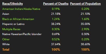
There is no reason, however, to suggest there are significant disparities in Covid-related deaths in LA, which are the ultimate measure of the virus’ effect. Current data show the virus has claimed lives in various ethnic and racial communities in LA County at levels approximately in line with overall populations totals for each group.
This table, based on data from the U.S. Census Bureau and LA County’s public health department as of September 18, 2021, shows the total number of deaths in each of the ethnic or racial segments tracked in LA County; the percentage of overall Covid-19 deaths accounted for by each group; and the percentage of the overall population of approximately 10 million that each group represents.
| Number of Deaths | % of Total Deaths | % of LA County Population | |
| Hispanic/Latino | 13,011 | 53.7% | 48.6% |
| White | 5,699 | 23.5% | 25.9% |
| Asian | 3,247 | 13.4% | 14.5% |
| Black | 2,116 | 8.7% | 7.7% |
| Native Hawaiian/Pacific Islander | 81 | 0.3% | 0.2% |
| American Indian/Alaska Native | 53 | 0.2% | 0.2% |
| (Data from County of LA Public Health and the latest available ACS estimates by the U.S. Census) | |||
There are some disparities, but none diverges drastically especially given the margins of error inherent in such statistical reports.
This likely strikes some readers as strange. You have no doubt read about racial or ethnic groups accounting for outsized shares of deaths from Covid-19.
It’s a notion that has been bolstered in the minds of many because of charts like this, from the county health department’s website.
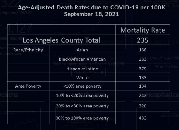
Bear in mind, please, that the data presented in this case is “age-adjusted,” weighing deaths of younger people more heavily than those of the elderly. It’s a form of analysis that has some appropriate uses but has been left unexplained to an alarming degree by the legacy and social media throughout the pandemic.
There is good reason to consider the age of Covid-19 victims, and to cross reference such data to race and ethnicity. The death of a number of 80-year-old White folks likely tells doctors, scientists and policymakers something different than a toll of 40-year-old Blacks.
But there’s more to consider than age and ethnicity, especially when it comes to the death toll as the ultimate measurement of a public health crisis.
It’s therefore notable that I had to pull the actual numbers on death tolls in LA County out of the confused reporting by the public health department—and make my own comparisons to U.S. Census data on the local population—to get a look beyond the age-adjusted data. It took some extra work, but what I was seeing in everyday life wasn’t matching the reports by the legacy media or the claims on social media or the narrative from the health department itself.


It would seem the legacy media has a problem in general—beyond LA, in any case—when you consider the coverage in Orange County. Legacy media outlets, plenty of social media mavens and a major public university in OC seem to have conflated the pandemic with the racial reckoning and also gotten caught up in covering politics instead of the pandemic itself.
This should be of special concern because such misinformation flourished even though the Orange County Health Care Agency provided much more clarity in tracking Covid-19 and its effects in its territory, including a clear view of death tolls through the lens of ethnic and racial segments of the population.
Consider this chart from the website of the Orange County Health Care Agency, as of September 17, 2021:
 That’s clearly stated and presented.
The numbers align to each group’s share of the overall population to a remarkable degree.
Yet I received this headline from the University of California-Irvine not long ago:
“UCI-led study finds disparities in O.C. rates of COVID-19 infection, mortality”
I read through the press release from the school, which is widely considered among the top research universities in the nation. It strikes me that the document strained to suggest racial and ethnic disparities in mortality—or death rates—as in this paragraph:
“Among those who tested positive for SARS-CoV-2 infection, Asians were more likely to die than non-Hispanic whites. People from ZIP codes with higher household density, less education and less insurance coverage were more likely to be infected and die, and those with lower incomes were more likely to be seropositive.”
Notice that the first sentence is about race and ethnicity while the second switches to socioeconomic factors.
And then comes this wordy walk back:
“…race and ethnicity categories like Hispanic or Latino and Asian are too broad, so it would be highly beneficial if, in the future, we could have more specific information. For example, our local Asian population is extremely diverse, and lumping them into a single category probably masks some important differences in risk of infection or death between different Asian populations.”
You can read the full press release yourself here.
I find it to be confusing at best and misleading at worst.
I also think that such misinformation flows because too much of our legacy and social media simply takes notes on these sorts of conflations and concoctions, passing them along without checking them against everyday reality.
Which brings me back to where I started, wrapping up my line of reasoning with this suggestion: The next time you read some media account where the reporting doesn’t match the premise, providing no payoff on the headline or tangible example that supports whatever story is being told, ask yourself this: Where’s Eli’s ear in all of this?